Screwball
-
Posts
1,746 -
Joined
-
Last visited
-
Days Won
2
Screwball's Achievements
")


-
Boxcar Willie at the Hollow Inn, Cornhole, Ohio, circa 1980s. The hobo singer. Little dive bar in the middle of nowhere and a good place to get beat up. Place was packed. Entertaining inside and out. He put on a great show. Had a nice career as it turned out. We survived. Only one I ever been to.
-
Driving in Boston? Who would want to? I've driven in a lot of big cities and I think Boston was the worst of the worst. Got stuck in the loop (if you call it that) downtown and couldn't get over to exit and was stuck doing about 10 laps until I could. Of course that was the wrong road, but I got out. I was trying to find a truck dealership on Beacon St. I was lost so I gave up. Came up to a toll booth and paid the guy a buck or two and asked where was Beacon St. was. He said, you just got off of it. Really, how do I get back on? Do a u-turn he says. Right, a u-turn across 3 or 4 lanes of traffic? Everybody else does he says. So I did. Of course I had to go through the toll both on the other side. Guy wanted two bucks and I said I just paid over there. That's over there, and this is here, give me the two bucks. OK. What a mess the traffic was. That was years ago during the "big dig" so that probably didn't help. The taxi ride to the airport was a hoot too. I think the guy ripped me off big time. I didn't care since it wasn't my money and a neat way to see the city without having to drive.
-
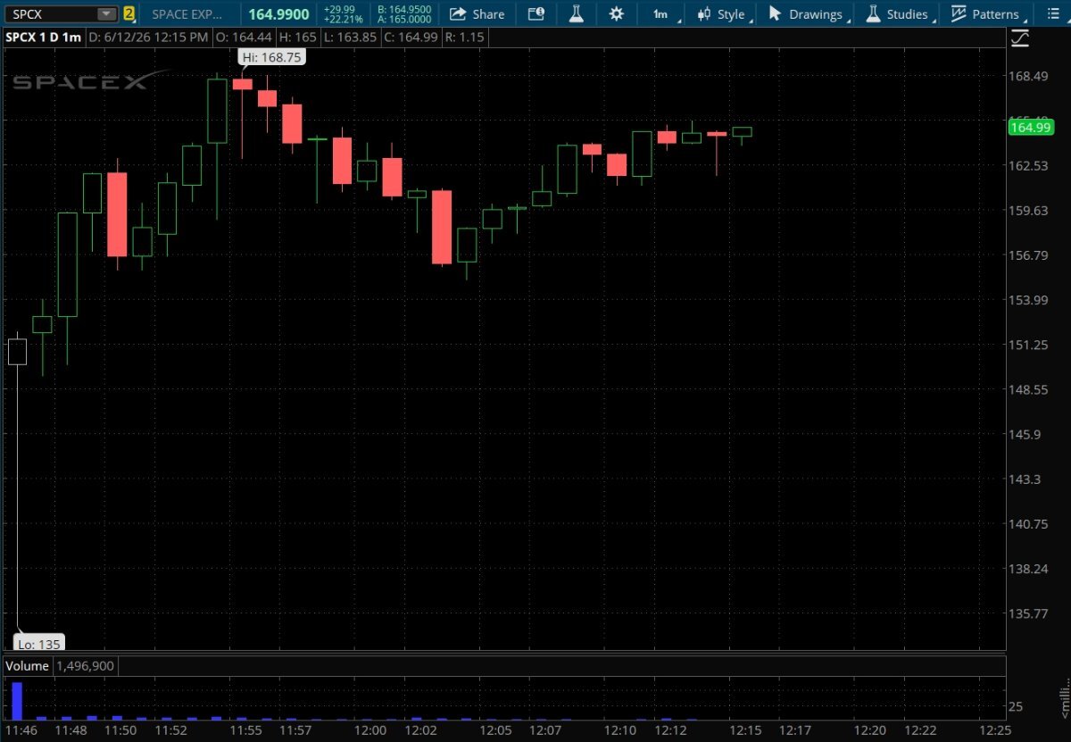
I'm sure everyone is on pins and needles to see Space X IPO debut today. Trading on the NASDAQ under ticker symbol SPCX it finally hit the tape at 11:46 am today. Price started at $135.00 but quickly the market took over. The broader market is trading at +299 on the Dow, +27 on the S&P, and +40 on the NASDAQ. Space X at $166 as I type this.

-
No. Funny. I talk to a buddy every night who, like me, started out as a mechanic back in the late 60s early 70s. We could fix our own cars. Not now, that ship sailed years ago. Special tools, fuel pumps inside gas tanks, starters under the intake manifold, batteries under the back seat, and every piece on the car that can be saved, cheapened, or made so it's easy going down the assembly line, they will do. You can't work on them and they don't want you to. I'll bet I could still get around in my 1979 souped up Chevy C10 pickup if I didn't break a telephone pole with it. Probably couldn't buy gas for it today.
-
The "small block" Chevy was arguably the best engine ever produced. It certainly made an impact on racing, and still does today. 900 hp engines in dirt track sprint cars based exactly on the old small block. 18436572 Firing order since day one.
-
Great article. I remember so many of those cars. When you make a whole bunch of something, you are bound to have some issues. That's part of engineering, manufacturing, and production. You can't **** up too many times when you make gazillions of them. Some might call it Cpk. I still don't know how we made the **** we made because corporate America was a giant cluster **** inhabited by inept ass kissing dreamers who's first goal when walking into a room was to find a mirror. Good thing us foot soldiers who flew under the radar limited the damage best we could. And they breed...
-
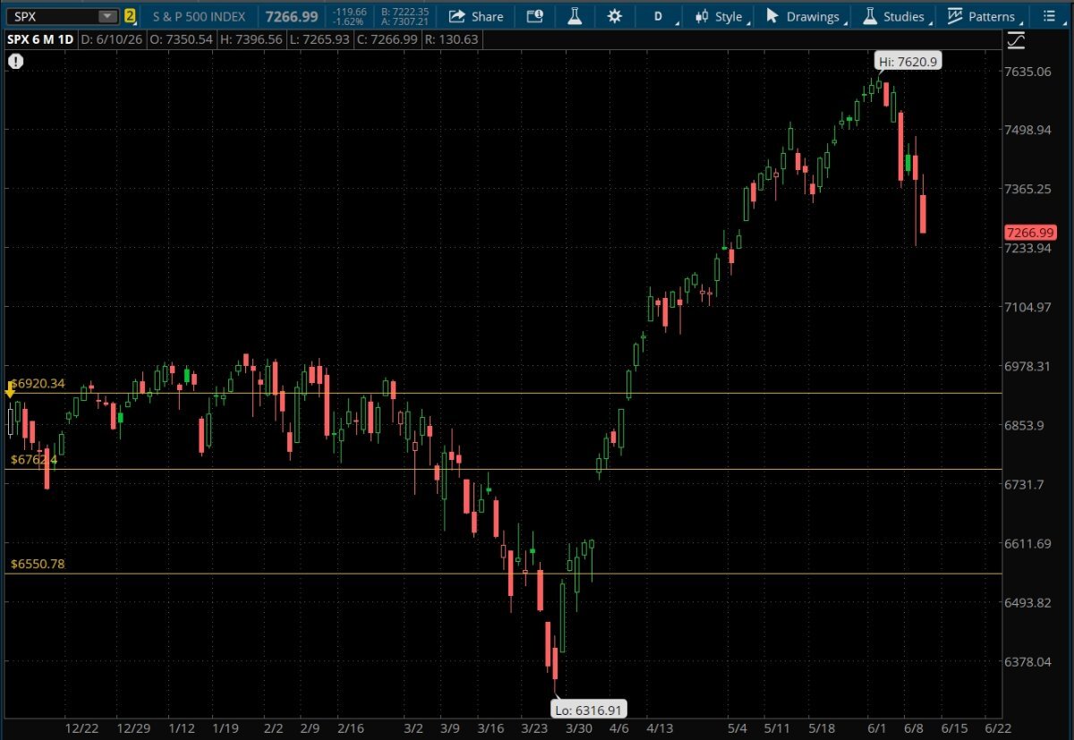
Chart porn needed. 6 month S&P. Yellow horizontal lines are from before this chart, the little yellow arrow way on the left pointing down is the last rate cut. All three main indexes look similar by chart porn standards. Of note, there is a huge gap to be filled down around the 6740 level. As I type this the futures are up a tad.
-
This might fit here. First: Sunday Socials - from Wyandotte, MI page of some sort. The schedule is in the links, but the June 14: Ultrasonik – Leave Those Kids Alone band is really kick ass. Bunch of young kids.
-
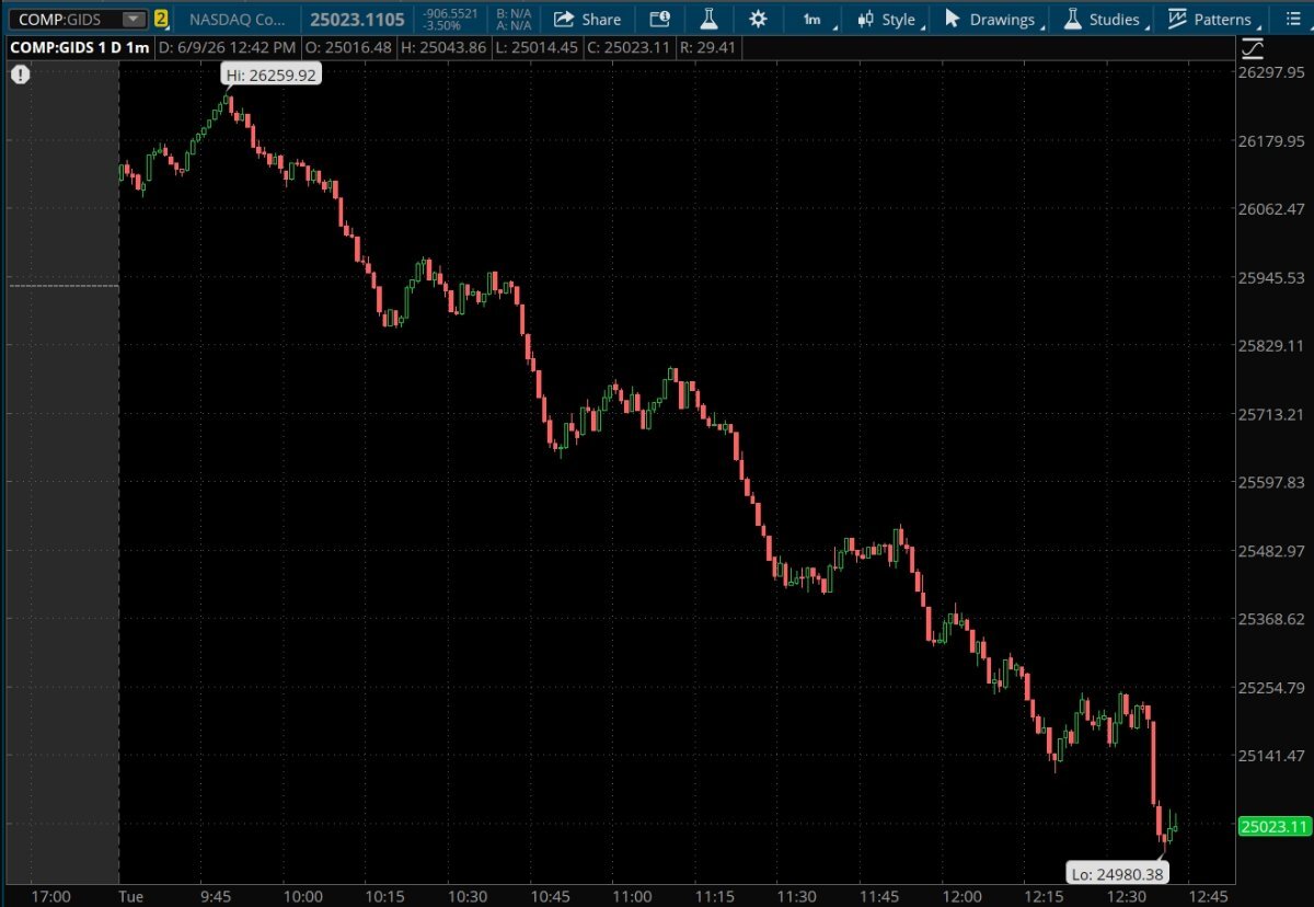
NASDAQ - high at 9:49 then...as the heat map above shows;
-
Here is the complete documentary minus the outtakes (which were great) Youtube (runtime 1:17 minutes); Floored
-
In that documentary they talked about a rule that if you hit someone on the trading floor you were fined like 300 bucks. A guy knocked someone on their ass, threw 300 dollars on his chest and said when he gets up I'm going to hit him again. A wild breed for sure.
-
Makes sense.
-
Just for fun. Youtube video. Trailer for a documentary made in 2009 about the floor traders in Chicago. Also how the computers replaced them. Our markets at one time traded in fractions. Chicago and NY had the big trading floors. Hand signals to buy and sell back in the day. Wild stuff. Once the computers took over... Great book by Michael Lewis of Moneyball fame. Flashboys - link to AMZN. Flashboys - AMZN All about how the tech and computers found more advantages to skim money. Probably back when the movie Wall Street came out (87, looked it up) they were trading in fractions and on the floor using hand signals. Flashboys came out in 2014ish. He documents the incredible progress of the tech. And that was a long time ago...
-
At some point do we have to wonder if AI is running the markets? High frequency trading, access for latency, packet sniffing, dark pools. The smartest guys in the room with 20 year old technology now turned over to our old buddy AI. What could possibly go wrong?
-
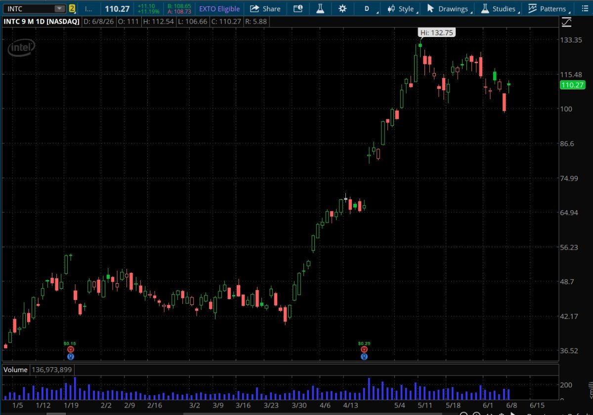
Chart porn from the beginning of the year. INTC went vertical in March it looks like. Have no clue why. There is a HUGE gap that will eventually fill. Giddy up!